2017
Kids Appeal Brand
Barwon Health Foundation
Challenges
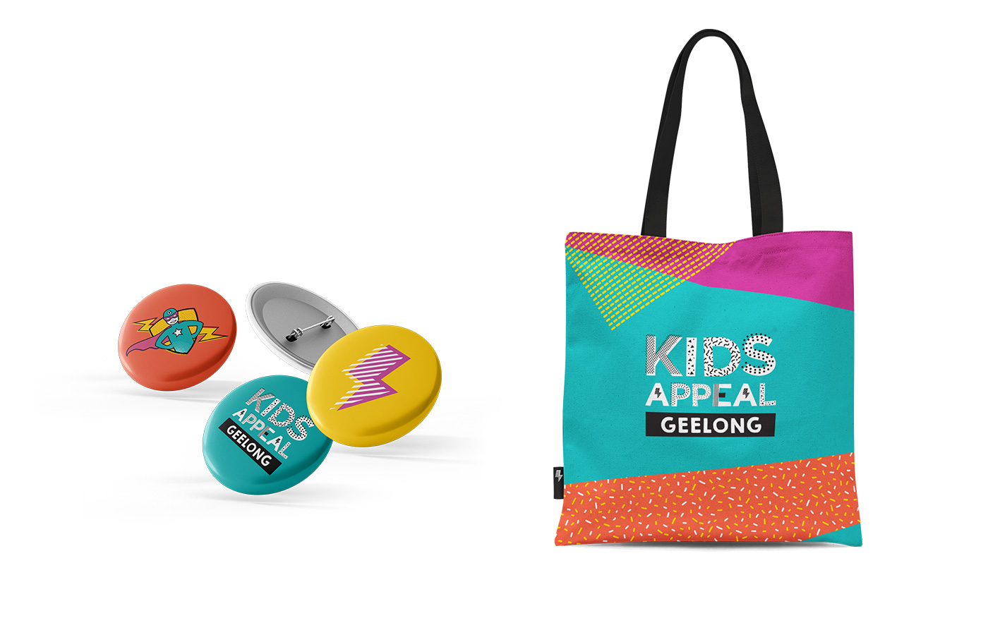
Grindstone was approached to design the visual identity for a major campaign for a new Children’s rehabilitation centre in Geelong.
The appeal is a partnership between Barwon Health and Cotton On Group and aims to raise funds to support construction of a unique space where Geelong kids and their families can thrive. Grindstone undertook this work as part of our ongoing pro-bono contribution to community causes
Strategy
A full brand development process was undertaken, enabling the Grindstone creative team to create a robust framework from which the brand could communicate. This involved the development of a brand manifesto, archetype and key brand messages to support the visual elements of the identity.
Outcomes
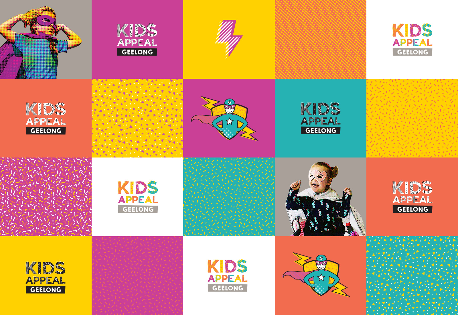
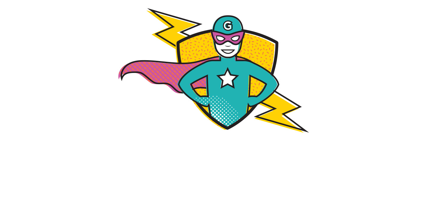
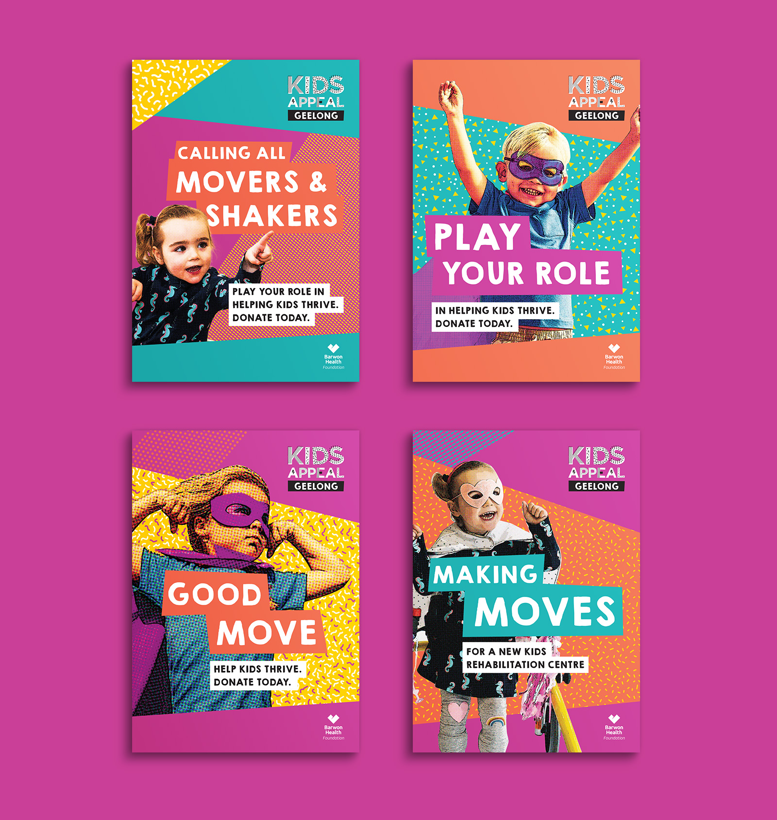
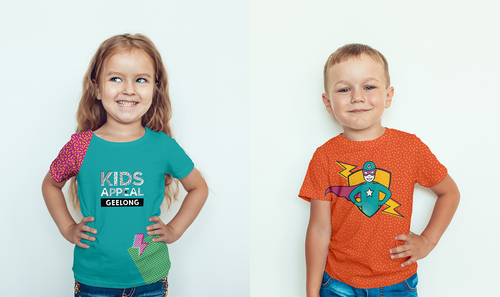
Grindstone drew from the theme of movement, in both the physical and social sense, to create an identity that celebrates all that is good about being a kid – the sense of freedom, fun, adventure and colour. This was expressed in the fresh and bold colours and patterns contained within the logo and supporting elements.
The brand archetype was built from the playful child. Full of movement, energy, cheek and childlike confidence. To articulate this, the character of a child in superhero dress-up was developed. This full suite of brand elements helps ensure the Kids Appeal Geelong has got the moves to accomplish its goals and have some fun whilst doing it.
Services
- Brand Strategy
- Brand Development
- Brand Style Guide
- Design
- Apparel design
- Social strategy